Responsive Images on Autopilot
Sign up for free
What are responsive images?
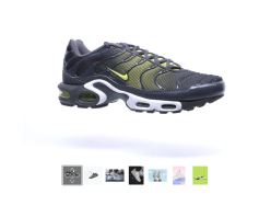
Responsive images are automatically scaled to suit the users’ screen. Smaller screens receive smaller images, Retina screens receive Retina images. Pages load faster and users enjoy a more personal experience.
Personalized for every visitor
Sirv introduces a new benchmark for responsive images. Rather than serve the nearest of 3 or 4 fixed widths, Sirv delivers the exact dimensions per device. It’s the ultimate solution for today’s myriad of mobile devices.
Responsive and optimized
Newly generated images are created in just 0.15 seconds, then cached for CDN delivery in just 0.001 seconds. Images are converted to the most optimal image format (often AVIF) to a fraction of their original size.
Lazy-loading on demand
Even better than fast loading is no loading (when it’s not needed). When an image is out of sight, Sirv only loads it if the user scrolls down to it. This lazy-loading technique brings yet another boost to loading speed.
Learn more
Responsive images for every platform
Any type of website can use Sirv. Apps for some popular platforms make it even faster to integrate.


Plugins and extensions
Upload your website images to Sirv with free and ready-to-install plugins and extensions for WordPress, Shopify, Magento, and more. Sirv team will gladly guide you if any questions come up.
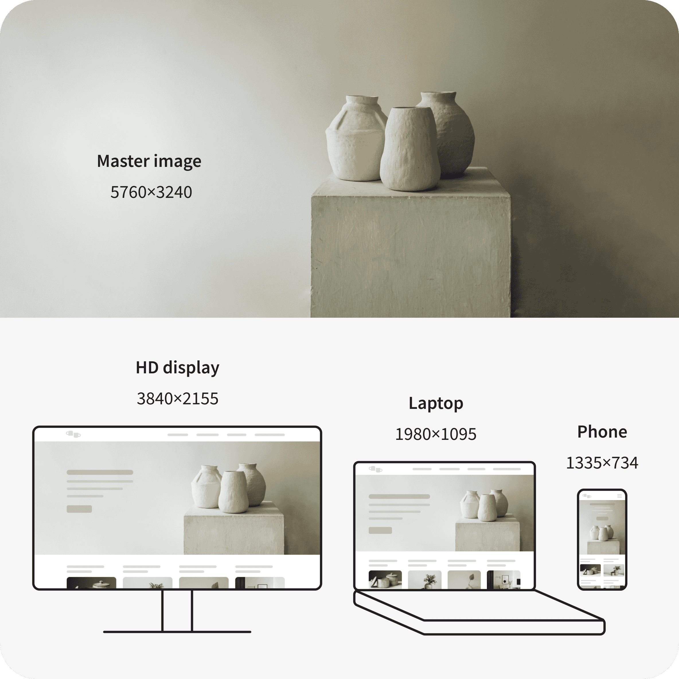
Learn moreOne master image is all you need
The fresh new approach to truly responsive images
The old way
- Resize image into at least 3 sizes.
- Double up the 3 sizes, for Retina screens.
- Export them in the formats you want (JPEG/WebP/PNG).
- Optimize them for web delivery.
- Write the code to detect and serve the right image.
<img srcset="car-320.jpg 320w, car-480.jpg 480w,
car-800.jpg 800w" sizes="(max-width: 320px) 280px,
(max-width: 480px) 440px, 800px"
src="car-800.jpg">
The Sirv way
- Upload one image.
- Copy/paste the code.
<img class="Sirv" alt="black car image"
data-src="https://demo.sirv.com/car.jpg">
<script src="https://scripts.sirv.com/sirvjs/v3/sirv.js">
</script>
Increase conversions with beautiful responsive images
Get started for free

